FISHEYE PICTURES
by AenTan • Uploaded: Feb. 14 '08

Float
(Floaters:
8 )
Description:
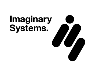
The logo mark consists of 3 Japanese-style brush stroke elements, 1 long, 1 short and a dot to convey an image of both fish and eye minimalistically.
As seen on:
Fisheye Pictures
Status:
Client work
Viewed:
4012
Share:


Lets Discuss
I like the overall look of those strokes, but I can't figure out where the fish is?%3Cbr%3EThe Font could look better
Replywow! the website looks cool!
ReplyI didn't see a fish or an eye, but either way the mark is very expressive. I see a person diving.
ReplyI saw a person diving too. Looking harder I can see the fish shape, the dot being the eye but the diving person was definitely the first impression and I wouldn't have noticed the fish if it wasn't for the name. Still looks awesome though :-)
ReplyLove your style... Very impressive and inspirating...
ReplyPlease login/signup to make a comment, registration is easy