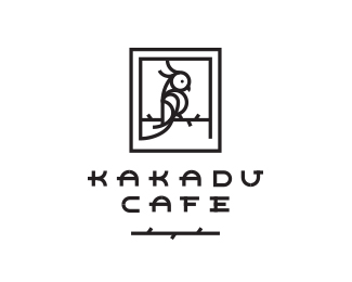
KAKADU CAFE
by JacekJaniczak • Uploaded: Sep. 27 '16 - Gallerized: Oct. '16
Description:
https://www.facebook.com/jjaniczak/
Status:
Unused proposal
Viewed:
4392
Tags:
kakadu parrot animal bird cafe
Share:



Lets Discuss
I think it's too spiky, especially that branch the bird sit on it and the ornament beneath the typo. It looks like barbwire ;) Straight line would be better in my oppinion :) Composition and estethic are marveles!
ReplyI like. I agree the barbs might just be clutter. But more importantly, it's getting a little pinched, especially around the foot, tail feathers, branch.
ReplyI would change the font. And I got rid of the very fine details
ReplyInteresting!
ReplyPlease login/signup to make a comment, registration is easy