ProVino
by JayKay • Uploaded: Feb. 09 '08 - Gallerized: Feb. '08
Description:
Wine web site. Contest Entry.
As seen on:
-
Status:
Nothing set
Viewed:
18185
Share:


Lets Discuss
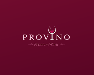
Beautiful work Jay. Although, with the wine glass protruding on the left has made the 'tag' abit off centred. Maybe make the 'tag' abit more prominent. Love the type, love the colour, love red wine. Cheers.
ReplyThanks Chanpion and you are right. I've made the tag a bit bigger which has hopefully helped!**Cheers! :-)
ReplyQuites classy. Nice colours too. As an alternative to wine 'swishing' in the glass you could be a couple of bubbles on on the surface of the wine. Just a thought.
ReplyIt's a fantastic mark Jay, my only crit (which just could be my screen) is I have to almost squint to see those flourishes be the tagline, could they be a little stronger perhaps?**But as I said, great work :)
ReplyThanks Guys.**Firebrand%3B that's not a bad idea, I'll have a play... do you not think that might suggest a fizzy drink though?**With the swishing I wanted to symbolise the tradition of releasing the aroma from the wine before tasting it, as we all know the smell of the wine is a very important factor and one which accompanies the whole wine drinking experience. What I'm trying to say is that there is more to it than taste - this is the whole deal here! Hope that makes sense..
ReplyHmm that's a possibility but wine ad campaigns often have a couple of bubbles on the surface line but in this logo they'd probably be too small anyway. I see where you're coming from with the swishing, makes perfect sense.
ReplyGreat colors nice solution
Replyi prefer the swishing over bubbles. you tend to see more bubbles in most logos dealing with beverages. good job!
ReplyAwesome concept, Jay! Just two observations:**1. I think that writing the tag with Italic is not justified and doesn't work right.*2. Perhaps I would play a little bit with the tag line and I would try another fonts, too.
ReplyThis works well!!
ReplyNice, however you may want to consider the fact that the glass looks like a devil's pitchfork. I'd smooth it out a little.
ReplyDoesn't the Devil carry a Trident?
ReplyNice work JAYKAY.
ReplyThanks, LOGOMOTIVE %3B-D
Replyyes... this is very fine.... indeed!
ReplyBeautiful mark!
ReplyCreative Logo Design. I think the wine glass should be thin as fonts.
Replyhttp://www.vigorbranding.com/jackie-blue-restaurant-branding.php**The wine glass mark and use of it for the %22i%22 has already been done. This is well executed, but derivative. Sorry.
ReplyI highly doubt your example is the first time a glass has been used to replace a letter in a word and I highly doubt that mine will be the last... %3Bp
ReplyNot to mention this can be trademarked as it's part of the logotype.
Reply@Jaykay*A wine glass, with a large bell, with a swishing effect replacing an %22i%22 in the word? It's extremely close. It's your design. I, personally, would want to know if something was that close to a logo I designed. I would then go back to the drawing board.**@Logomotive*%22can%22 or %22can't%22, anything can be trademarked and registered in the States. **Trademarked or not, the goal of designing logos is to create something unlike anything else out there. You're supposed to be visually positioning the company separate from any other company.**Like I said. It's your work and your design.
Reply@ vigorbranding, well actually no not everything can be registered due to infringement. I can only assume your also not the first to come up with this concept.
ReplyWe did pretty extensive research. I can't say for sure that I was the first to come up with this concept. I can say that we looked through the USPTO quite extensively and didn't find anything. We also searched through logolounge and logopond and found nothing remotely close. This was in printed publications over two years ago.**I'm not sure why a derivative design is being defended as it is. Let's just start putting swooshes in logos and call it a day.
Replyvigorbranding, I'm not sure if you're accusing me of copying your or not but I can assure you I did not. I'd never seen your logo before in fact.**To be perfectly honest, a logo where a wine glass is to be included... replacing one of the letters (%22I%22 being by far the most convenient) is hardly a far fetched or original thought process. This was pretty much the first thing I thought of, I drew it on paper, it looked ok so I built it.**At the end of the day, I wouldn't worry too much as 1/ the logo is for a web site only and 2/ it is for a competition and almost certainly wont win anyway %3B-)
ReplyLove the 3D wine / water effect inside the glass, see a bit of that on here really adds some subtle depth.
Replyyou've definitly got my vote on this one! Love the light on the top left of the glass., it makes the logo work. It would be interesting to see it printed out, but as it's only for a competition, this probably won't happen?
Replyvery classy
Replyso did it win?
Replyitsgareth%3B No :-)
ReplyHaha, all you have to do is look at %22vigorbranding%22's portfolio. It ends this argument instantly.
ReplyHi,
ReplyI would like to ask if I can use your logo ?
Which font have you used ?
Thank you
Please login/signup to make a comment, registration is easy