Ryander Cup Pirates
by clarksynergie • Uploaded: Feb. 04 '08
Description:
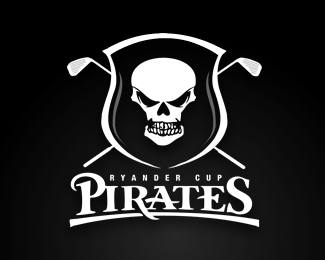
After using the Orlando Pirates crest as an unofficial logo for a number of years, the Ryander Cup Pirates golf team wanted their own identity.
Whilst keeping some loose ties to the Orlando Pirates logo, I designed this logo which was displayed on the teams polo shirts and caps.
Status:
Nothing set
Viewed:
9860
Share:




Lets Discuss
i love the skull. very well done. the type is great too, but for some reason it looks awfully familar to type I've seen elsewhere for the word Pirates..however, I can't think of exactly where..(sorry I know it's not real helpful to say such a thing, lol.) anyway, good work!
ReplyThis is cool. I love the type as well, although I think perhaps the kerning on Pir needs adjusting. I thought perhaps the type looked similar to the Pirate's Cove Mini Golf logo, but I just checked and it's quite different.
ReplyGreat skull!
ReplyThe Pirates logotype used here actually belongs to the Whitworth University Pirates. The logo was designed by the Helveticka agency in Spokane, Washington. It is trademarked and registered with the NCAA. You can see the original logo at www.whitworthpirates.com.
Replyman ... man .... man ........ !
Replydo you have a direct link tburkhead i dont see any?
Replyhttp://www.whitworthpirates.com/images/logos/PirateGray.jpg
ReplyPlease login/signup to make a comment, registration is easy