Masons Pumpkin Patch
by leighton_hubbell • Uploaded: Jan. 30 '08 - Gallerized: Jan. '08
Description:
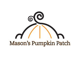
Logo for a line of children's clothing.
Status:
Nothing set
Viewed:
9246
Share:


Lets Discuss
very nice! in this I see both a pumpkin %26 the top of a baby's head...with the ears on the side... which I think is what you were going for...right? cute stuff!
ReplyThat's exactly what I was going for. Thanks.
ReplyReally a clever design solution!
ReplyI dig the icon but am not a huge fan of typeface in relation to it. The face feels a bit too thin and the slab serifs don't relate to the curves and round ends of the illustration.
Replyperfect mark, I love it. As a mother and a designer, it draws me in instantly, but there's something about the type that turns me off. I think because yu leave the smooth lines from the mark by using a serif
ReplyI tried to create a contrast to the smooth lines of the mark. The font I chose is still a 'rounded' version of a slab serif. I didn't think it was too severe and was afraid if I mimicked the mark too much it would blend.
ReplyPlease login/signup to make a comment, registration is easy