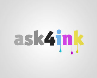
Ask4Ink
by shiimera • Uploaded: Jan. 28 '08
Description:
This is a mockup of a logo for a customer who sell ink cartridges.
Critics are welcome.
Thanks.
Status:
Nothing set
Viewed:
5702
Share:



Lets Discuss
I like the idea! Only criticism - the gray background subdues the effect of the colour, especlly the yellow. Could we see what it looks like on a white bg please? Also the yellow %26 cyan could be brighter, more saturated. Especially the yellow, it's a bit lost at the moment...
Replyi like this but the drops looks the same, add at least one different, and i agree with drewboy, sature the colours, what's that font ? :D its nice! :D
ReplyNice font! (what's?)*But color it's cyan, magenta %26 yellow are not quite good....
ReplyThank you guys for your comment**@DrewBoy : thank you for the suggestion, i will try to replace this version with another with a lighter background, i overlayed on this one a radial gradient layer, which make the color look darker, but i think it's better than having the CMYK color, i really don't like that color scheme.**@wilsonink %26 Marcinlewandowski : the used font is OfficinaSanBlkITC...
Replythanks for the answer shiimera.
ReplyPlease login/signup to make a comment, registration is easy