Grove concept (unused)
by OcularInk • Uploaded: Jan. 28 '08
")
Float
(Floaters:
20 )
Description:
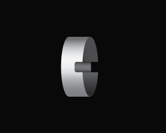
This is an old concept I worked on for The Grove Salon. Felt like posting it up.
Status:
Unused proposal
Viewed:
10026
Share:


Lets Discuss
very good idea
Replygreat!!
ReplyClever :) !!!!
ReplyThx!!
Replygood call on using a G with a nice little serif as the thumb support!
ReplyThanks, dshikama!
Replyvery clever!!:)%7E
Replyrock on! i just love clever thought out logos! simple but killer impact!
ReplyGot the grove..!
ReplyGreat concept. I think variation in the line thickness of the blades would help them better relate to the G.
Reply@ andrendhiq : Thanks. :-)**@ kidd81 : Thanks, dude. Rock on!! ( %3C--- That's like my catch phrase. Weird. :-P )**@ Tats Me! : Do what?! :-P**@ grubedoo : Fantastic idea. The blades have been bothering me. Thanks, man.
Replyjust saw this ... awesome
ReplyThanks, bud!!
ReplyPlease login/signup to make a comment, registration is easy