magicthree
by bartodell • Uploaded: Jan. 18 '08 - Gallerized: Jan. '08
Description:
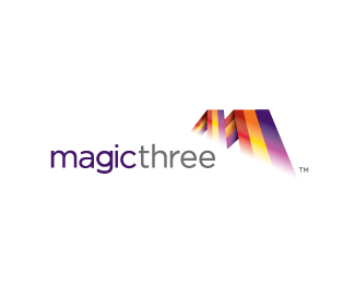
Logo for a new web development company.
Status:
Nothing set
Viewed:
14381
Share:



Lets Discuss
Excellent. Love colour scheme.
Replywhat i really love about your style man.. is that you dont have one!.. thats so awesome!
ReplyThanks Thomas.**Thanks Nido. I appreciate that. I have learned you have to be adaptable and you have to give the client something different each time you design or you become a niche designer. There are those exceptions to the rules when a client says %22I want the end result to look like this one from your portfolio.%22 Which always tends to sway the creative curve. :)
Replyit's a nice one.%0D*do you really need the bottom white in the mark? (White gradient)
Replywoah!
ReplyThe white gradient adds to the overall dimension of the shape. %3B)
ReplyYeah it would look too 'static' without it, once again Bart has delivered a winner :)
ReplyReally great use of colors, but %5Bjust as Rambal%5D I am concerned about the white part of the gradient, because of print results.
Replygood style!
ReplyVery nice one Bart. I see the %22M%22 and the 3 all at once. TO echo everyone else...great style as well.
ReplyNeed a logo designer? Hire this guy.
ReplyWow, thanks for the comments all!
Replynice. I'd like to see it in a solid as well.
ReplyMagical indeed! Nice one Bartman! in my faves!
ReplyNice!
ReplyThat's a great logo, my eyes were drawn straight to it from the main page of the site!
ReplyNice logo Admarcbart! Love the color combo and movement. Agree with chanpion,*a fave!
Replygreat logo mate
ReplyKerning is too tight between the g and the i.
ReplyNice addition to your showcase, dude!!
ReplyVery nice. Great colour scheme. The only thing I would change is the white gradient. Perhaps it would look better if it were more transparent?
ReplyLove colors, Bart!
ReplyPlease login/signup to make a comment, registration is easy