Bison, Vancouver
by Seamoose • Uploaded: Jan. 18 '08 - Gallerized: Jan. '08

Description:
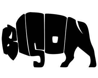
Logo design for rock band from Vancouver B.C.
Status:
Nothing set
Viewed:
68219
Share:


Lets Discuss
AWESOMNESS to the MAX!
ReplyHowever, sorry really cool but perhaps make the I into the other front leg? I Love everything else about it. GREAT idea.
Replywow nice!
Replycool one!
ReplyGlad to see this here. Such a great logo!!
ReplyAwesome!
Replywow.. this is clever..
Reply!!!!!!
ReplyWow, this should be in LL
ReplyWhile it's really clever and all I think it could have been executed a little better. The concept is outstanding and the thought process is great but there are many un orthodox things about it after looking closer. Especially the missing front leg. The front hoof going the opposite way kinda bugs me too. I'm just picky about detail that's all.
ReplyYeah I agree with Mike%3B it's a 3 legged Bison, the missing front leg could easily be added to the 'I'. Strong concept though...
ReplyThank everyone for all the feedback, I'm really happy to have joined such an active community. *Regarding the design, overall I'm happiest with the B and N, ultimately I decided to stop editing it as we needed to print T shirts. I did at one point try to use the 'I' for the front leg, but thought it took away from the over all shape of the bisons frame. I guess its a square peg that almost made it into a round hole %3B )**@Lawrence Anderson, excuse my ignorance but what is 'LL'?
Reply@ logomotive : The general public probably won't ever notice the lacking detail. But I agree, attention to detail is very important.**@ Seamoose : I'm fairly certain LL is a reference to the site LogoLounge.com
Reply@oc, well I think people will see only 3 legs thats not really detail right? Where are the standards people ? so it's good enough huh? wow.
ReplyThis is a great piece. And concerning the missing leg, I think its great the way it is. Adding a leg would destroy the nice shape and the neck would disappear. Just suppose the 4th leg is exactly behind the %22S%22 leg.
ReplyAt first glance it looks quite rough and unpolished... which once I found out it was for a band fits perfectly. The absolute brilliance of it, however, is evident once I discovered the negative spaces for the B and N functioning as an eye, a horn, and a tail. Amazing!
ReplyReminds me way too much of this logo:**http://www.bisonindustries.com/**I know an employee that's worked for that company for over two decades.**I'll give you the benefit of the doubt, but if you were influenced by it, please state so.
ReplyI would have to say that the logo jimmiejo's put a link on for is far better...**I gotta be honest here... i dont see whats so special about this?... i remember about 20 years ago at school doing something similar with the word 'fish'... %26 even then it wasnt original... everyone in my class was drawing it!... i agree with logomotive.. it needs a 4th leg!.. the fact that the hind legs are in motion cries out for the 4th leg to be visible!.. %26 the front leg that is visible looks like its been snapped at the joint!... all in all i really feel im missing out on what everyone else is raving on about!!!!
ReplyThis logo is a more intelligent solution in my opinion. I like the way the tail is found within the N and the way the horn and eye of the bison is revealed within the 'B'. The version linked seems like a much easier execution. All they did was take all the letters of the word BISON and make them look like a bison body and then added feet and a tail. I prefer this logo.**@ logomotive: I agree with what you're saying. We should hold ourselves up to a higher standard. But at the same time, nothing will ever be perfect. Even so, I also agree that there are parts of this logo that could have been improved and further developed.
Replyyeah I guess we could debate on this until the cows come home:-)
ReplyHoly balls, I wish I had thought of that. Great logo, man.
Reply@jimmiejo - I had not seen bison industries logo previously, thanks for pointing it out. **Regarding the legs, a google image search for bison shows about 70%25 of the profile images of the animal with front legs together and back legs apart, its how they graze. Even if that wasn't the case I personally found this execution to be the best solution. I cannot imaging using the 'I' for a front leg and not ruining the body shape, or highlighting the curved %22S%22 leg bottom*http://www.livingwilderness.com/wildlife/bison-standing.html**Clearly its not anatomically correct but thats not the goal. My original thought was for the design to look like a logo for a 1970's junior hockey league team, so its a bit rough and retro (reflecting the bands music). If this was a corporate logo (%26 paid more than some beer %26 free shows) it would have been in fine tuned for another week at least.**Thanks everyone for the lively thread!**
Replyseamoose, do you have a 3 year old? http://www.wordworld.com :P**The concept itself is a 2 on a originality scale of 1 to 10. But compared to the other bison logo linked to, i much rather prefer this one, using the letters for the legs and all. It is rough, but i think it portrays the client well.
ReplyA 2 on an originality scale of 1 to 10? Hmmm...
ReplyBrought a massive smile to my face when i first saw it. After staring at it for a while, i can see other's points. But this is really well executed, and i'm gonna stick with my initial opinion, rather than think about her too much :)
ReplyWow! Nice... !!!
Replyhttp://www.mts.net/%7Eboyscout/Images-LinkBar/ManitobaBisonLogo-Website.jpg%0D*%0D*what about that then?? %5E%5E its not the word bison but still forms the silhouette of one. I'm with tammy on this one.
ReplyI like it. I think you can always do it better, but it works and it's very nice. Don't need the 4th leg. Congrats.
ReplyI love this one!
ReplyAwesome typography.
ReplyA timeless classic. I love it!
ReplyWell if you think about it the other front leg could be directly behind the other. It's a great logo I love it.
ReplyOr it could be one of those rare 3 legged plains bison.
ReplyThis logo is really identical to my home town's sports team logo: the Hot Springs Bison in South Dakota. It's actually the older version of our logo.**It's a great use of typography, but it has been done before. And I'm not saying that you can't redo a logo design, but this is practically identical. I wish I had pictures to show, but they don't really use that logo around here anymore.
ReplyYou'd think this would be a tough read, but it really works. Nicely done.
ReplyOne of the coolest logos i've seen!
Replyinteresting logo, also very similar to logo my agency did for province of Manitoba back in the day**http://www.agency59.ca/images59/Manitoba_Tourism.jpg
Replylogo is really nice
Replyhttp://www.jauria.net/ :S
ReplyPlease login/signup to make a comment, registration is easy