MINT
by SamDeMastrie • Uploaded: Mar. 02 '15 - Gallerized: Mar. '15


Float
(Floaters:
23 )
Description:
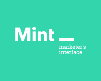
I'm very happy to announce that this logo (the main image) will be included in LogoLounge Book 9.
MINT—or Marketer's Interface—is a brand new networking organization catering to the account people within the creative industry. As far as I know, this is the first group within the creative industry that will recognize the non-creative managers and directors.
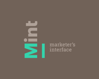
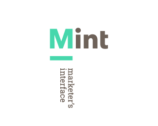
The brand uses a simple and flexible logo system: MINT and Marketer's Interface can be rotated and rearranged. Additionally, the whole logo can be abstracted into a series of rectangular shapes (as in the hover state on the website), subtly referencing elements from charts and graphs and the idea of mixing and mingling with other like-minded folks.
As seen on:
Marketers Interface
Status:
Client work
Viewed:
13332
Tags:
adaptable
•
system
•
green
•
brown
Share:


Lets Discuss
good one, Sam !
ReplyMy favourite color from the childhood. Like it!
ReplyThanks guys, much appreciated. Also, thanks for the gallery spot. Glad you guys like it.
ReplyFresh!
ReplyThanks Daniel.
ReplyLove plain typeface logos. Nice work Sam!
ReplyThanks Norman. This was a fun one.
ReplyPlease login/signup to make a comment, registration is easy