escapist
by contrabrand • Uploaded: Jan. 13 '08

Float
(Floaters:
1 )
Description:
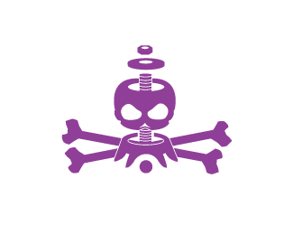
logotype and symbol for skateboard shop
As seen on:
escapist skateboarding
Status:
Nothing set
Viewed:
4732
Share:


Lets Discuss
Very nice. I like the mark and the concept.*Keep up the great work.
ReplyThe diagonal line in the top-left seems off angle, apart from that it's a good mark...
ReplyIt actually reminds me of the hammer and sickle.
Replythanks totally appreciate it. it was a fun concept to work with.
Replyi love this one.
ReplyPlease login/signup to make a comment, registration is easy