Nutriana
by sh1 • Uploaded: Dec. 20 '14 - Gallerized: Dec. '14

Float
(Floaters:
31 )
Description:
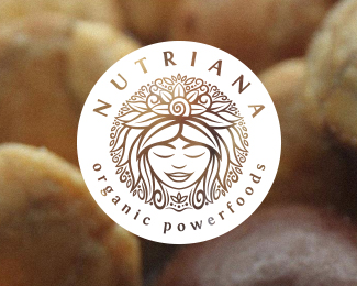
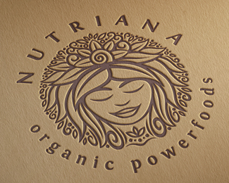
Logo for Nutriana organic powerfoods.
Status:
Work in progress
Viewed:
10290
Tags:
spiritual
•
sun
•
circular
•
mother nature
Share:
Lets Discuss
Feel the letters are a tad bit too loose, but other than that, I think it's great!
ReplyIn addition you can get rid of all the small elements.
Reply^ I disagree, that would take away from the sense of volume.
ReplyThanks a lot for your feedback everyone!
ReplyI wouldn't change the circular symbol but I think letter spacing could use some adjustments.
The lettering is a tad bit loose, but only if you pay it some real attention. And Mike pays real attention. So should we all. Worth adjusting.
ReplyI do agree with brenms disagreement with ru_ferret however, losing all the small elements would take so much away from what makes this endearing, not to mention whole.
I agree too. Adds "texture" and character and the best part about the Mark.
ReplyTexture and contrast!
ReplyYou were not wrong with "character" either though.
ReplyI like that use a single color
ReplyPlease login/signup to make a comment, registration is easy