kwgallery v2
by Chanpion • Uploaded: Jan. 10 '08 - Gallerized: Jan. '08

Float
(Floaters:
33 )
Description:
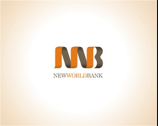
The client didn't mind the rose but insisted on a ribbon incorporating her initials. Ribbons are used alot in her business for all her gift packaging. One of her tradmarks I guess. This got the final nod.
Status:
Nothing set
Viewed:
10146
Share:


Lets Discuss
this is b**dy nice Chanpion!!
ReplyExcellent idea!!
ReplyHey Chanpion, you on the Gold Coast?
ReplyLove your work Chanpion!!
ReplyPerfect. This turned out awesomely.
ReplyGreat...
Replynice... more like gift oriented....
ReplyExcellent work on the mark Chan! I really like the fluidity, the movement you put in the ribbon. A superb flow! Congratulations.
ReplyGreat solution Chan. You've got ribbons all wrapped up.
Reply@Chanpion, nice ribbons.
ReplyVery cool Chan. Nice work my friend!
ReplyThanks everyone! Funny thing was, this was the original direction I took but went a full circle and came back to this one instead. Another hidden suprise I sprung on the client was the mark also represented a 'dragon'. The client was born in the year of the Dragon. I drew the initial ribbon horizontally in 2d with the tail much longer but that was when I gave the idea up and started on another one. The client was utterly bowled over. Cheers all.
Replyfirst impression: toilet paper*second impression: looks cool
ReplyBoth the %22kwgallery%22 font and the ribbon initials are nice but I don't think they work together.
ReplyPlease login/signup to make a comment, registration is easy