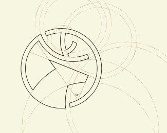
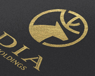
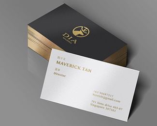
DIA Holdings
by bratus • Uploaded: Oct. 10 '14 - Gallerized: Oct. '14

Float
(Floaters:
45 )
Description:
Client: DIA Holdings
Location: Singapore
Branding Agency: Bratus
As seen on:
www.bratus.co
Status:
Client work
Viewed:
13762
Tags:
deer
•
animal
•
investment
•
financial
Share:
Lets Discuss
I think if you could lose those slits in the DIA it would improve what is otherwise an already very good and strong design.
ReplyI'd like to see how it looks without the rounded corners on the antlers so that it matches the rest of the linework.
Reply^ I tend to agree with Gareth here. The rounded ended antlers don't work as well with the sharp serif type, everything else has angles. Also what Nido said.
ReplyIs the mark off-center on purpose? Or is it flush-left?
Replywhy did my comment get deleted?
Replygood job :)
Replygreat icon!
Replynice work
Replyloved the icon!
ReplyYou're welcome.
Replyfeel Like Rodney Dangerfield Gareth?
ReplyI remember the first version, with the rounded corners...Feels so much better this way. And definitely without the slits in the type. Great advice from Gareth and Nido.
Replyhi, I think they just copy-paste your logo: https://www.viada.lt/
Replythis is ex LUKOIL rebrand in Lithuania...
@logo4u_lithuania Wow that's exactly it, minus some small tweaks
ReplyPlease login/signup to make a comment, registration is easy