AussieROO v2
by mope • Uploaded: Jan. 03 '08

Float
(Floaters:
1 )
Description:
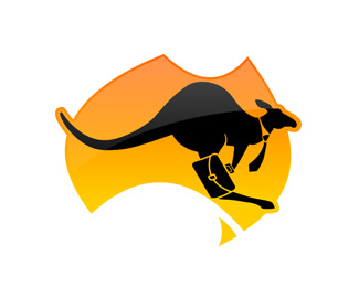
Final version of the logo for an Australian company who brings Australian and international businesses together.
As seen on:
AussieROO
Status:
Nothing set
Viewed:
3295
Share:


Lets Discuss
I like the logotype, but dislike the typography... If you talk about businesses, why do you use a fantasy font? That seriously against every rule!
ReplyHi Mope - this is a much better lead than the roadsign one. Well done
ReplyThanks for the comments. Appreciate it.*Beklad: I agree with you about the font. Originally I used Arial, or Univers Rounded (as you can see in the previous version), but the client insited on using this font, that was chosen by them. They may pick another version with a different background shape too. I try to convince them about the font, and the shape too. I'll post the final version anyway.
ReplyPlease login/signup to make a comment, registration is easy