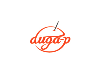
duga-p 2
by vld • Uploaded: Dec. 31 '07

Float
(Floaters:
5 )
Description:
Logo for "duga-p", fast food. "duga" means RAINBOW, "P" is... well something that makes things more complicated for me :).
Status:
Unused proposal
Viewed:
3953
Share:


Lets Discuss
There is some okay style here.**My concern is that I have no idea what kind of food they serve (not that that needs to stand out). This could be cool for an ice cream parlor but not necessarily work for a mexican restraunt. Your concepts are scattered and seem a bit incomplete. What's the direction? What's the idea? What are you trying to convey?
ReplyI think this is the most fun of all three.
ReplyDefinitely the most fun of all tree.. Love the font type!%0D*%0D*Did you draw it by yourself or..? If not, what's the name of the font?
ReplyTnx for the comments.%0D*%0D*@brankoj: it's a BlackRose font.
ReplyI really like this!
ReplyThanks for the reply man! Keep up the good work :)
ReplyMe too I like this one the best out of the three. True-True what do they serve, logo does not say. But you can see that they serve food. Reminds me of the ice cream that would come in shapes (specifically sherbet) Hmmm!
ReplyPlease login/signup to make a comment, registration is easy