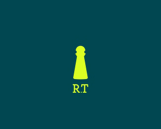
BIBOOK /2013/
by demark • Uploaded: Jul. 27 '14 - Gallerized: Aug. '14

Float
(Floaters:
15 )
Description:
Library
Status:
Client work
Viewed:
17911
Tags:
book
•
library
Share:


Lets Discuss
Clever.
ReplyYes, it is clever. Maybe it's me, I'm getting old... but I keep seeing things that I'm sure I've seen before. I'm not suggesting this is copied, just that I get the feeling I've seen this approach already somewhere.
ReplyBut all the same, well done.
I agree with you Nido can be a form similar, but this idea was created based on the name of the library. The library name is also my idea. Thanks for the good reviews!
ReplyHow original!
ReplyHmmm. This certainly looks really familiar.
ReplyI think I'm just being reminded of the concepts in the links below. I do think the execution is nice but, the concept isn't incredibly original. When I think of gallery spots, I think of designs that stand out in one way or another, especially originality considering it's becoming so hard to be original these days. :)
Replyhttp://logopond.com/gallery/detail/128010
http://logopond.com/gallery/detail/203438
http://logopond.com/gallery/detail/202323
http://logopond.com/gallery/detail/217638
http://logopond.com/gallery/detail/139119
http://logopond.com/gallery/detail/134395
Hmm...
Reply"this idea was created based on the name of the library. The library name is also my idea..."
How convenient.
Thank you logomotive!
Replytabithakristen & Chanpion in your portfolio also includes some works that have similarities with the logos of other designers. Chanpion in it is inconvenient it is reality) tabithakristen my logo based is the font B
Replyother work based on a book
I posted this on the homepage knowing it wasn't exactly an "original" concept. I was half hoping someone would point out the similar logos and put my mind at rest. The ones tabithakristen linked weren't exactly any of the ones I was thinking of, some seem way off too, but at least it confirms that I'm not going senile and that it has been done in some shape or form before.
ReplyI should also add that I like it more than the others due to its completely simple forms.
ReplyOh, I DO like this one. I'm just saying it's similar to others. Demark, you didn't have to be defensive. I never said you stole the idea or that you were over inspired. I simply pointed out what it reminded me of.....
Replyif the logo is not famous as Nike and Apple etc. quite possibly match. Different matter if my logo would be very similar to other logos in etom happened a coincidence and not inspiration
ReplyClean, simple, clever, outstanding!
ReplyNice work...I like the simplicity of the mark. The font choice and weight work well too.
ReplyI must say that this is one of the best logos that I have seen related to books.
ReplyThank You very much!
ReplyPlease login/signup to make a comment, registration is easy