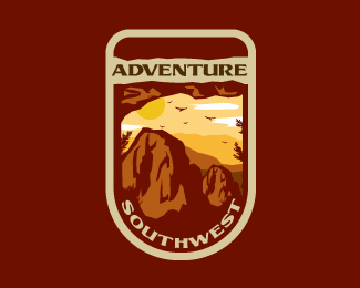
Adventure Southwest
by jaybeeworks • Uploaded: Apr. 11 '14 - Gallerized: May. '14

Description:
Can someone explain to me why both the client and my friends disliked this logo?
I love it so much btw.
Status:
Unused proposal
Viewed:
5611
Tags:
west
•
south
•
southwest
•
emblem
Share:


Lets Discuss
There are two things that can be seen out of place by those people:
Reply1) outer stroke is too clean comparing to the rest of the design which makes a strange contrast
2) landscape looks a bit like it was hmm... traced from a photo, not drawn from it
Thanks for the feedback, appreciate it :)
ReplyThis is an interesting remark since most of the people I asked said they had something with that thing under 'adventure' which, btw, should resemble a cave, sort of.
The other comment, well, it definitely isn't traced from anywhere else other than my head, so :) I like to play it realistic here.
Thank you again, you've got some great designs over at your portfolio :) Cheers
I dont agree that it looks traced. I DO agree that the border is too thin in comparison to the rest of the design.
ReplyI had NO idea that the viewer was looking out of a cave; that isnt clear at all.. perhaps the "view outside" should be slightly lighter in order to gain that perspective? And the top portion of the cave can be a bit more pronounced (see more of it).
Nice logo tho! :)
Please login/signup to make a comment, registration is easy