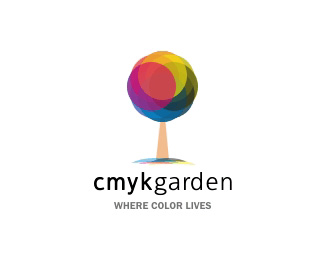
cmyk_garden
by rambal • Uploaded: Dec. 11 '07 - Gallerized: Dec. '07

Float
(Floaters:
57 )
Description:
cmyk garden is a online portfolio for all print works of the client. They are going to use the logo only in the web. I'm looking for your valuable inputs. So that I'll work further and show to the client.
As seen on:
http://www.cmykgarden.com
Status:
Client work
Viewed:
23570
Share:


Lets Discuss
I LOVE the mark...not a great fan of the 'CMYK' font, though.And I think you should get rid of the dots on either side of the 'garden'
Replylooks nice.*yes i agree with influxes... try to change the font and remove the dots
Replyi also agree... the mark is very nice... im not sure about the font... but i definitely dont think 'garden' should have the dots %26 also should not be secondary like that...
ReplyOne inconsistency I see is the colour of the tree trunk and 'garden'. Did you want to only use the cmyk colours in the logo? Also put a little (just a little) bit of a curve on the trunk. ATM it looks abit like a lollypop. Agree with the other on font choice. But overall, a great concept rambal. Cheers mate.
ReplyThe mark is unique however I think the type is less than desireable. I would choose a very nice round sans serif to balance this out.**I also seem to not understand if this is for CMYK Garden why you chose to showcase a tree in the icon? Just a thought.
ReplyI love the Mark. Definitely agree about the font. I understand why you've separated the name into two levels, but perhaps you shouldn't. I'd go with a more simple font. The mark though.. brilliant, i favorited it immediately :)
ReplyG R E A T!!! So nice...
ReplyGeezus this is beautiful. Great work
ReplyJust the same comment as %22influxes%22. He's very right!
ReplySHE is very right* :)
ReplyThank you all for notify the font.%0D*Meanwhile accept the mark.%0D*%0D*That's why I posted here and get your feedback before showing to the client.%0D*%0D*Always my 2nd version is better than the first.%0D*Coz, you people are well supporting me to grow.%0D*%0D*Thanks Logopond and the community.%0D*%0D*%22My 2nd Version is here%22:http://logopond.com/gallery/detail/21255
ReplyThe way the colors are presented all mashed together tightly it doesn't read as cmyk to me....if the cmyk dots making up the tree were smaller and at different screen angles more closely mimicking print I think it would be more successful. Right now the color tree reads more as an rgb color spectrum to me. That's my thought...
ReplyYou could have done it better. Three circles has to be enough, Cyan Magenta and Yellow. In the middle you got Black (K). And the overlapping colors make the secondary colors (Red Green Blue).
Replygood work anna...
ReplyI love the idea But i'd have to say it doesn't look like it uses CMYK on the tree. I think the mark would be more memorable if it were easier to relate the color to the name. Great logo.
Replynice like this one best. what font is the CMYK?... good job.
Replyi dont like the font.... ad why didnt you just use cmyk?
ReplyPlease login/signup to make a comment, registration is easy