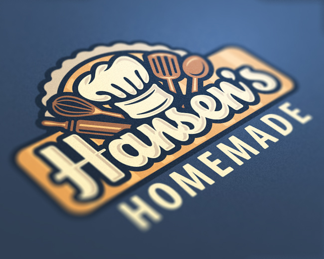
Hansen's Homemade
by LuBeraDesign • Uploaded: Feb. 26 '14 - Gallerized: Mar. '14

Float
(Floaters:
50 )
Description:
Logo for Hansen's Homemade, a small business that makes tasty home-baked treats and pastries.
Status:
Work in progress
Viewed:
15,597
Tags:
•
pastry
•
bake
•
craft
Share:


Lets Discuss
Very Nice.
ReplyDid you try making the yellow swoop above the hat the same as the beige/stripe treatment behind the text?
Thank you!
ReplyI did, and a few other colors as well, but the text color seemed to contrast the best out of the ones I tried. But I appreciate the comment and thought!
I tweaked the color slightly, and used your suggestion. I like it. :)
ReplyLoving the style of this one.
ReplyI agree with Bart. Congrats on the gallery spot! Well deserved. :)
ReplyThank you both, I really appreciate it! I'm extremely happy to be gallerized!
ReplyVery good!
Replythis one looks really nice! Very nice job!
ReplyThanks, Mateoto and Palattecorner!
ReplyTasty mark
Replygreat colour. blue and yellow are complementing colours.
ReplyThanks, ladygrey and jakarta! I'm very happy with this palette, too.
ReplySee, here, you have an absolutely perfect marriage of illustration and type. I really love how they play off of each other.
ReplyAs for your "handmade" modifier, I would definitely reduce the point size, and remove the curious diamond bullets. To me, they don't add anything, and are random shapes that don't appear anywhere else in the lockup - so they're curiously disconnected.
Further, have you tried integrating "homemade" into the enclosure? Right now, since everything else is enclosed, "homemade" feels like it's just hanging out by itself. One thing you could try is add another rounded rectangle box to the current one that overlaps it along the bottom, and is as wide as pie shape in the background. Merge that rounded rec with the main one you currently have, and you've now got a space for "homemade."
Anyway, just some additional thoughts. I see you're not really looking for critique, but thought these suggestions might help you for future logo designs.
Well done on your feature. Deserved.
ReplyWhat He said Congrats!!
ReplyCongrats you deserve this!!
ReplyThanks guys! I'm so thrilled right now!
ReplyPlease login/signup to make a comment, registration is easy