ahoyhoy 2
by bigjerk • Uploaded: Dec. 07 '07

Float
(Floaters:
1 )
Description:
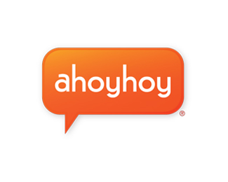
proposed logo for a portal website...concept is fun communication...orange is a mandatory inclusion....
Status:
Nothing set
Viewed:
1823
Share:


Lets Discuss
Though the bubble is overdone, I like this one better. Somehow the readability is much better then the other one.**Try to use a different symbol maybe or a more 'original' bubble...if possible.
ReplyPlease login/signup to make a comment, registration is easy