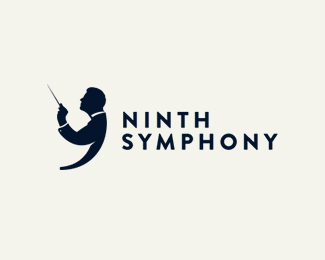
ninth symphony
by ytne • Uploaded: Dec. 29 '13 - Gallerized: Jan. '14
Description:
logo for PR agency
Status:
Client work
Viewed:
18267
Tags:
symphony
•
ninth
•
piskorek
Share:


Lets Discuss
Kosa
ReplyGreat concept.
ReplyLove how you brought out the #9 in the Composer. Great Job!
ReplyWonderfully simple and elegant!
ReplyClever!
ReplyBeing a client logo (rather than a fictitious creation) makes this even more creative. Well done.
ReplyTotally fresh and I love it.
ReplyOnly one little remark, try to align NINTH with SYMPHONY (I-Y, N-M, T-P, H-H pairs).
I thought there was a positive and negative space between the hand and the face..... but great job though
ReplyVery, very nice Lukasz!
Replyso nice! love it1
ReplyLove the typography! Does anyone know which is it or where can I get it?
ReplyPlease login/signup to make a comment, registration is easy