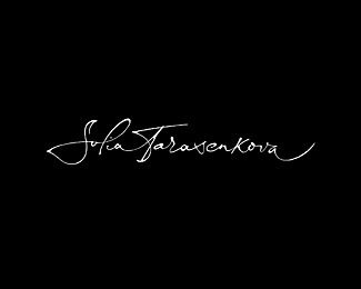
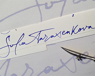
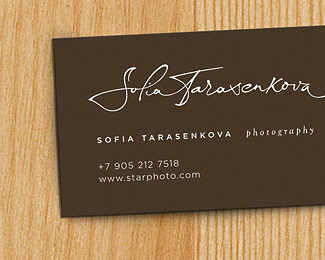
Sofia
by RaitG • Uploaded: Dec. 10 '13 - Gallerized: Dec. '13

Float
(Floaters:
62 )
Description:
Logo for photography
Letters & mark
Status:
Client work
Viewed:
14665
Tags:
photographer logo calligraphy
Share:


Lets Discuss
Beauty! Simple word to describe that!
ReplyCheers!
gabrielove, thanks
Replylooks really amazing !!
ReplyGood work. I'm glad for you.
ReplyTAS, Nikita. Thanks a lot
Replybeautiful! please add type!
Replyor, should I say, put the signature and the feather mark together.
ReplyTHEArtistT thanks
ReplyI think this elements will be use separately (on site & on print)
This is amazing! Strange however seeing one in the gallery without any type! :)
ReplyAwesome!
ReplyThis is amazing! Strange however seeing one in the gallery without any type!
Replyyeah not sure who added it... I'll leave it in because the actually type seen in the variations is nice, but remember folks, without the type its not a logo - as it solely pertains to logopond - ie not enough branding for a mark to stand alone as a logotype yet.
I Like it! I would like to see a version with the type and mark together?
ReplyI'd like to see a version with type & mark together also. Whilst they're both nice on their own merits, I'm not sure as yet whether they blen well together.
Replyblend*
Reply'I'm not sure as yet whether they blen well together.'
Replyexactly
Nicely done. My thoughts on it are ditto to David's, without enough branding for the mark to stand alone and have a context is sort of difficult with the feather given the logo is for a photographer. Right out of the box without type, I'd guess it's for some sort of native tribe. It is a good mark though.
ReplyWHY Not? Let's see how it works out. Imagine the Plume writing it out?
Reply~......
Hello. Big thanks to be in the gallery & your comments
Replyagree with Hayes Image but I'll trying to put letters & mark together…
http://orbisistemas.com.br/ this meant to be used here?
ReplyPlease login/signup to make a comment, registration is easy