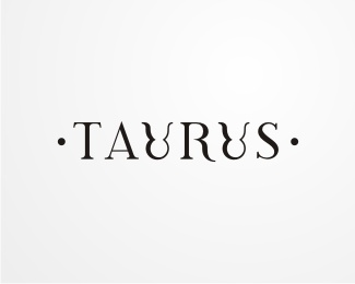
It's not really a logo that can be shrunk down to a cm square. Wonder if there's a septerate version for business card usage, etc? There should be if this identity is to work...
Nice job!**@ raul2hot : I disagree with you. Certainly this logo works for Print.**@ Sqwink.com : I could see this working on a business card. The logo can stand on it's own on one side, with the contact info on the flip side. I do agree that there could be some scalability issues when used at smaller sizes. However, it's all up to the designer to find the solution that works. And this works in my opinion.


Lets Discuss
cool:)
Replyhow does it looks in a smaller size?
Replyis the black bg part of logo??*this logo is only good for web.......sorry mate!
Replyi like it so much
ReplyIt's not really a logo that can be shrunk down to a cm square. Wonder if there's a septerate version for business card usage, etc? There should be if this identity is to work...
ReplyNice job!**@ raul2hot : I disagree with you. Certainly this logo works for Print.**@ Sqwink.com : I could see this working on a business card. The logo can stand on it's own on one side, with the contact info on the flip side. I do agree that there could be some scalability issues when used at smaller sizes. However, it's all up to the designer to find the solution that works. And this works in my opinion.
ReplyI love it
ReplyReally stands out. I think it could be manipulated to work well on business cards, signage, etc.
Replyone of the best ideas i've seen in a while! :)
ReplyOOOOOHHHHHH TRIPPY.
ReplyTrajan is so overused today. I'd like to see this set in another face.
Reply@id29: Just because a great typeface is overused doesn't make it any less of a typeface -- helvetica anyone?*Trajan works perfectly for this logo.
Replyi like the ideia, and the visual effect, but i doubt that this has good reading in smaller sizes
ReplyThis would have to be my favorite logo so far. VERY clever and unique.
Replyoriginal and elegant at the same time...well done
ReplyI love this if that white line wasn't underneath it.... its awesome though.
ReplyYeh the white line could go
ReplyAwesome! Love it!
Replyi agree with comments about the line, think that goes and it's a nice design - different!
ReplyPlease login/signup to make a comment, registration is easy