Eclipse
by HayesImage • Uploaded: Sep. 10 '13 - Gallerized: Sep. '13


Float
(Floaters:
42 )
Description:
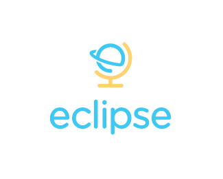
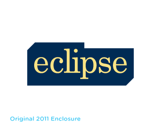
Redesign of a logo I developed for Eclipse (no relation to eclipse.org) in 2011. The key point of this brief were to create a more relaxed, approachable brand, less authoritative. See variations for the 2011 design.
Eclipse offer specialist training software - mostly linguistic, but also teachings on grammar, syntax, etc. The use of the globe device reinforces the idea that language & communication is a ‘global’ exercise.
Conceptually the design is of course inspired by a globe on its axis/stand. Since the idea of the eclipse is not necessary representative of solar or lunar, the mark focuses on how eclipses are created, orbit – The precise moment the Earth/Moon orbit is in relation to the Sun. The planet also forming an abstract E, creating a subtle monogram.
Typographically, the design has made a departure from the schoolbook styled typeface to a more contemporary rounded face to suit the mark.
Status:
Client work
Viewed:
18723
Tags:
Eclipse
•
Yellow
•
Blue
•
Language
Share:


Lets Discuss
I really like this.
ReplyThanks Alex!! Working on some collateral options now :)
Replyclean, simple and effective.. nicely done.
ReplyGreat stuff, Josh.
ReplyThanks guys, glad you like it :)
ReplyGreat!
ReplySolid solution, Josh.
ReplyThanks guys!! Another job done, onto the next :)
ReplyVery similar to this:
Replyhttp://logopond.com/gallery/detail/194904
^ Only thematically.
ReplyPlease login/signup to make a comment, registration is easy