Royal house
by olalb • Uploaded: Aug. 04 '13

Float
(Floaters:
20 )
Description:
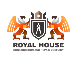
Logo for a construction company. The final version of the experiments with the shape and color. What do you think? Can be combined coat of arms and a color scheme?
Status:
Client work
Viewed:
3163
Tags:
birds
•
logo
•
griffin
Share:


Lets Discuss
black-white version is best!
Replyi agree with Ladygrey here :)
ReplyNot liking the font all that much. It is too mundane for the mark. I'm not suggesting something swirly or eccentric, but something with character. Like a short slab serif or something.
Replygreat.......!
ReplyThe mark is awesome. I would agree with the type critique. You could have a sans-serif like you have currently, but with a bit more unique letterforms. Nice job.
ReplyLadygray, BuroBlauwBrug - yes you are right, but for some reason I believe in a color option and do not want to miss it :)
ReplyTHEArtistT, leighton_hubbell - Hi! Your comments are absolutely true, make us think and raise their level work. Font for me by far the most difficult part of the job.
Thank you all :)
ReplyPlease login/signup to make a comment, registration is easy