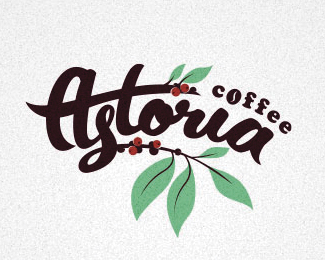
Astoria
by Artem • Uploaded: Jul. 26 '13 - Gallerized: Aug. '13

Float
(Floaters:
30 )
Description:
- New York coffee shop.
Status:
Unused proposal
Viewed:
6817
Tags:
astoria
•
coffee
•
emblem
Share:


Lets Discuss
I think if ASTORIA was that whitish color, it would improve the hierarchy. Right now at smaller sizes and when I squint my eyes tend to look away from the type, and up towards the moon. Looks great though.
ReplyI agree with above comment. Smashing logo though!
ReplyThank you colleagues for your comments. Brighter color in type really works better.
ReplyHow to contact with you? :)
Replyolexenko@bk.ru - here is my mail box
ReplyPlease login/signup to make a comment, registration is easy