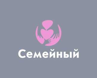
I guess it isn't getting that attention because to my eye it feels as if this has been done before, certainly not with tree hands in this manner but two hands forming a heart is old news. Not that , that takes away from this concept, just that people's eye will no doubt bypass it as muscle memory reflexes.
I agree with you David. Been there done that, BUT with so many logos out there these days, it's hard to come up with something new. I think this is a nice addition to the Heart Hand concept we have all seen. Just adding that extra little element gave it more meaning. I also like how the hands are not the same.
I agree with David and Mike that this is another hand design, and people may look past it. But I like the fact that it felt a bit different to me and after looking closer and seeing the detail of taking a man, woman's and the child's hand and making it all come together into a family gathering of care. Made it a real nice change from the normal hand-makes-heart. Glad I stopped to look longer.
Great discussion here. Thank you guys. Mike, you correctly understood about father, mother and child here (all three hands are designedly different). I think the choice this sign for the LL8 book says that it is quite different from other logos (similar subjects). But I agree with each of you, to some extent, heh :)
Love this. Absolutely Love it. Sure we've seen hand shaped love hearts before but this feels new and it communicates brilliantly with the inclusion of the childs hand. Nice job.
 (Eng - Family)")


Lets Discuss
Selected for LL Book 8
Replywow .. this is so clever and so sweet ... a great concept with little appreciation ... and that's a shame, people !!!
ReplyCheers Bernd! :)
Reply^agree with Bernd. sweet and needs more attention, Ivan.
ReplyNicely done, sir.
I guess it isn't getting that attention because to my eye it feels as if this has been done before, certainly not with tree hands in this manner but two hands forming a heart is old news. Not that , that takes away from this concept, just that people's eye will no doubt bypass it as muscle memory reflexes.
Replyvery nice, i love it!
ReplyI agree with you David. Been there done that, BUT with so many logos out there these days, it's hard to come up with something new. I think this is a nice addition to the Heart Hand concept we have all seen. Just adding that extra little element gave it more meaning. I also like how the hands are not the same.
ReplyI agree with David and Mike that this is another hand design, and people may look past it. But I like the fact that it felt a bit different to me and after looking closer and seeing the detail of taking a man, woman's and the child's hand and making it all come together into a family gathering of care. Made it a real nice change from the normal hand-makes-heart. Glad I stopped to look longer.
ReplyGreat discussion here. Thank you guys. Mike, you correctly understood about father, mother and child here (all three hands are designedly different). I think the choice this sign for the LL8 book says that it is quite different from other logos (similar subjects). But I agree with each of you, to some extent, heh :)
ReplyThe pink and the light grey really works well! Btw, the left hand has three fingers, if someone noticed...
Replyyou guys are right.. in the gallery
Replyone finger is hidden behind the others Xalion, also all cartoons only have 3 fingers and a thumb :D
something news)
Replyexcellent work
Thanks for comments and thanks for gallery spot! :)
ReplyLove this. Absolutely Love it. Sure we've seen hand shaped love hearts before but this feels new and it communicates brilliantly with the inclusion of the childs hand. Nice job.
ReplyThanks Matt.
ReplyIt's cute mark but I would go with 'softer' typeface.
ReplyGood idea
ReplyI agree with all that's been said. Yes, it's been done before, but this is a really nice, fresh take on the concept. Awesome work, Ivan.
Reply@Xalion, the left hand has 3 fingers because it's more of a side view, and the pinkie finger is hidden behind the hand.
Thanks for feedback guys.
ReplyPlease login/signup to make a comment, registration is easy