Mobilux #1
by gcm • Uploaded: Nov. 10 '07

Float
(Floaters:
7 )
Description:
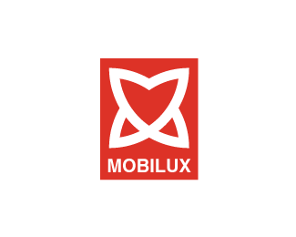
Logo proposal for a furniture manufacturer. The symbol combines the letter "M" with two cube faces. Also, the symbol can be seen as an arrow. Critics are welcome.
Status:
Nothing set
Viewed:
8049
Share:


Lets Discuss
This to me has a negative meaning. The arrow you are referring to points down. This seems to reflect instability with the company and their product line.
ReplyNice mark but i agree that it has a negative undertone. Is there a particular reason you chose red?
ReplyI see what you're saying, and I agree (more or less, I was thinking that the type will receive more attention if the arrow points down)*thanks
ReplyNice mark. I don't see the negative aspect, I rather see a shield which is nice. But I agree, it doesn't really say furniture. Actually this would would do well in an industrial area...
Replyi see a book...
Replyi was affraid somebody will say this :)
Replynice brand*I like it
ReplyI like it, i see M letter and the box/cube as furnitures basic shape ... like the brand ...
ReplyPlease login/signup to make a comment, registration is easy