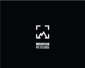
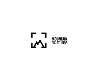
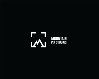
Mountain Pix Studios
by kiddraice • Uploaded: May. 16 '13


Float
(Floaters:
7 )
Description:
A conceptual logo for a nature/ outdoor photography studio. The M is used as representation of the mountains combined with the use of focus/ view finder representing the camera. The mark is designed to look simple, clever, and minimalistic.
Status:
Student work
Viewed:
10810
Tags:
minimal
•
simple
•
black & white
•
studio
Share:


Lets Discuss
Because of the name you used, I probably wouldn't justify the type with the mark. Make the type bigger with the same line thickness as the mark. That would work better for your landscape format as well. For a student piece this is excellent work! Maybe a little 'National Geo' inspired but I really like it.
Replyappreciate it! will definitely try it out thanks!
ReplyPlease login/signup to make a comment, registration is easy