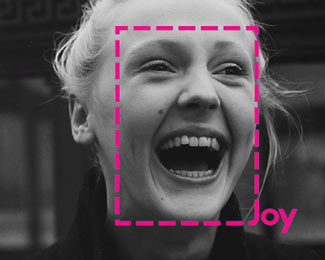
Joy Photography
by artdirectorco • Uploaded: May. 02 '13 - Gallerized: May. '13


Description:
This logo was developed for a local photographer. It acts as a smile/joy detector.
As seen on:
Fioo
Status:
Client work
Viewed:
13675
Tags:
pink
•
joy
•
photography
•
pink
Share:
Lets Discuss
interesting
ReplyAgree, interesting approach!
ReplyCan do a lot with it branding wise :)
ReplyOutside the box logo
ReplyGood idea
ReplyYeah! and as Josh said, this has some excellent branding potential.
Reply^Agree with all above. clever approach.
ReplyAgree ^^
ReplyMuch like the branding campaigns Time magazine (with the red box) and National Geographic (with the yellow box) have done in the past... with their trademark boxes dropped over images to show a cover crop.
ReplySo even though derivative of that...this probably works because of the name integration.
ha-ha, fun!
ReplyExactly what Josh said. Horizontally,vertically,probably even circular etc., it frames the subject. Winner winner.
ReplyRead this Thread, I think this idea has so much potential. http://logopond.com/threads/4/535
ReplyDamon, I can see this logo going very, very far. Get that sucker published!
Replya great idea :D
ReplyGreat idea! Would love to see the rest of the applications of the logo :D
Replythis is a perfect example of a logo being the spring board for an entire branding idea that can really get people excited about applying the ideas across various platforms. brilliant.
Replyhehe clever :)
ReplyGenius.
ReplyNice idea!
ReplyPlease login/signup to make a comment, registration is easy