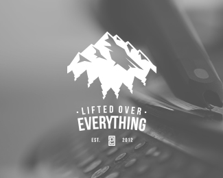
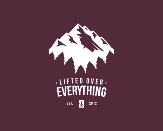
Lifted Over Everything
by BGodby • Uploaded: Apr. 24 '13 - Gallerized: Sep. '13

by BGodby • Uploaded: Apr. 24 '13 - Gallerized: Sep. '13


Lets Discuss
Nice logo pal
ReplyReally like the feel of this one, the angle of the trees kind of bug me though.
ReplyRight off the bat it reminds me of http://logopond.com/gallery/detail/173770
ReplyColors on this one seem to be overly-altered with the hue tool.
ReplyThanks logomotive! I was going for an enhanced perspective, as if the viewer was standing far below the tree-tops. Similar to this -
Replyhttp://beautifulhoodriver.com/images/20100604015111__mg_7986_6-10-10.jpg
Good catch cream5! I have to admit, they are strikingly very similar, but to be honest, I've never seen that design until now. I start on paper to avoid this sort of thing. It's a little heartbreaking to see!
Cool one!
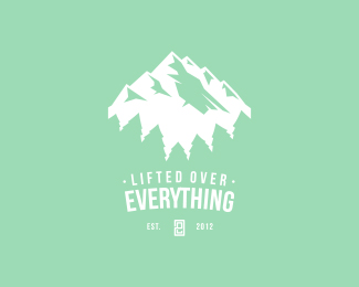
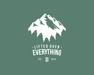
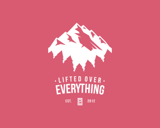
ReplyUpdated the colors. I'm experimenting with different color schemes, trying to avoid the ordinary. It's more of personal challenge than anything.
ReplyI think it would give it some better depth if you had the mountain's snowcaps overlapping the tree line a bit. They seem too separated at the moment. Also, some variation in tree height would make it seem more random and natural. Currently, the trees are all pretty similar in size.
ReplyPerhaps you could shorten the whole crest shape to bring the mountains and trees closer together without too much fuss.
Otherwise, I like the color palette and the feel of it with some minor adjustments. Cheers.
I feel like what Logomotive means is that the trees look like a bunch of black people gathered in a semi-circle and the mountains look like a bunch of Klansmen in hoods. The racial underpinnings of this logo are disturbing, really. Just my opinion though.
ReplyAwesome color palette
ReplySo very insightful, JustMyOpinion ;D
ReplyI can feel the mountain breeze. Noice!
ReplyPlease login/signup to make a comment, registration is easy