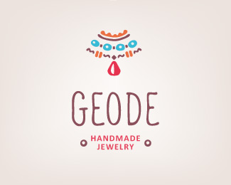
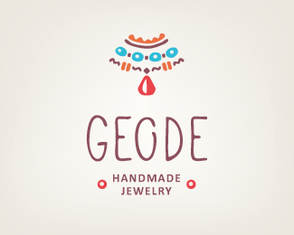
Handmade jewelry logo - Geode
by vfolio • Uploaded: Apr. 17 '13 - Gallerized: Apr. '13
Description:
Brand identity creation for a small handmade jewelry company.
Main ideas to reflect: handmade, genuine, natural, fancy, friendly etc.
The work is in progress. We strongly disagreed with my client about the chosen concept, so we need a third opinion ))
www.vfolio.ca
Status:
Work in progress
Viewed:
23193
Tags:
logo
•
geode
•
jewelry
•
natural
Share:




Lets Discuss
Very authentic.
Replyperfect .
Replyvery perfect)
ReplyHey, thanks a lot guys!
ReplyThat's one of the first things my client was looking for - authenticity.
But his first reaction was quite negative to all the proposed concepts...
Any ideas what could be wrong or which elements need a refinement?
Replythat o looks kinda like a c in comparison to the g
ReplyVery nice!
Replywhat is the chosen concept?
ReplyWhat was his feedback, and where are the other concepts?
Reply@logomotive Chosen after unpleasant discussions.
ReplyFirst client's reaction was:
ReplyNone of 3 proposed concepts. Could you make another one?
That's why I'm asking for opinions
As I told him that an extra concept costs extra money )) and he chose this one.
ReplyNormally all my clients are satisfied with the results...
So the question is not which one from 3 is better, but is this one good or I don't understand something...
And if NOT, what exactly could be wrong?
ReplyFresh colours & formation of the mark. I think the structure of the logo looks a lil all over the place. I will make Handmade jewellery in one line to reduce the verticality of the logo and change the type to a hand-written font. The mark and type, both have a strong presence, maybe reduce the hight of GEODE to have a better unit...:) All the best
Reply^ I tend to agree, I think overall there is way too much going on here. Simplify!
ReplyThanks a lot, Nitish!
ReplyI'll try to work a bit the composition and I think I should rewrite the letters too
For sure, logomotive! Thanks!
ReplyThis has a charming feel :) Very nice typo! Hope to see an update
ReplyAfter many variations I decided to keep the vertical composition. I rewrote the name, trying to keep the handmade feeling but in a more elegant way, I hope ))
ReplyWhat do you think?
very interesting...,great!
ReplyThank you, Hanuman!
ReplyLove this feel :)
ReplyRly wow! Great typo man!
ReplyPlease login/signup to make a comment, registration is easy