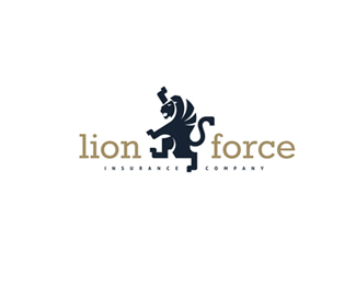
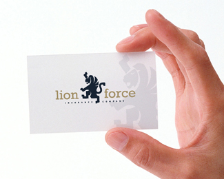
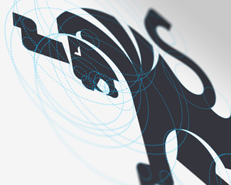
Lion Force
by Baryshpolets • Uploaded: Apr. 08 '13 - Gallerized: Apr. '13

Float
(Floaters:
56 )
Description:
Stylization heraldic lion.
This design is available for use in many business areas, such as banking services, lawyer, notary, insurance company etc.
Status:
Unused proposal
Viewed:
15616
Tags:
retro
•
single
•
silhouette
•
being
Share:

Lets Discuss
Strong mark, Nekiy!
ReplyThanks ladygray!
ReplyOddly, I like how the subhead type is so small it almost acts like a dotted stroke.
Replyhe has that karate kid stance going on right?... nice...
ReplyClean and beautiful
ReplyIt seems like the lion is faced the wrong way. The general impression is facing right is forward, and facing left is backward. It is not a hard and fast rule, but still an impression that can work for or against you. I like it otherwise.
ReplyPlease login/signup to make a comment, registration is easy