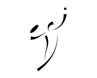
Emma & Jonathan
by AL • Uploaded: Oct. 31 '07 - Gallerized: Oct. '07

Float
(Floaters:
22 )
Description:
A wedding monogram. Used in stationery stuff, etc.
Status:
Client work
Viewed:
22485
Share:


Lets Discuss
I like it.
Reply...very nice work!!!%0D*
ReplyNicely drawn, well done.
ReplyI love how subtle and powerful it is at the same time. Great work.
ReplyThis looks great! *My only suggestion would be to maybe make the decender of the %22e%22 shorter and the replace that line by making the %22j%22 curl up more. I think that would make the %22e' cleaner and make the %22j%22 more legable. I could not read the %22j%22 initially.
ReplyI agree with ahab, it's awesome, but the j looks like an i. Having the little curl on the bottom of the j would make it more legible. Rad idea though.
Replywow, really cool
ReplyHey, really like your heart shape and like to include it on my site with a link back to yours!**Given that this is for a wedding, it'd be even better if you could share on my site (cluelessclay.com) on the inspiration behind it. Also, the tools that you used to build this logo.**Contact me pls, love to have your post on my site as I'm running a whole series of designs focused on heart shape. Cheers!
ReplyHave posted it on my blog and emailed you separately as well, cheers!
ReplyI truly like this logo. I am looking for something very similar for an upcoming business venture. Please contact me at your earliest convenience at charbony_alexander@yahoo.com. Thank you very much.
Replyhttp://www.lancers.jp/work/proposal/2129691
ReplyVERSION UP!!
fake_death, the link doesn't work for me. You have to be a member to log in. Care to send me a screenshot? Send to alex at lenart dot pl Thanks :)
ReplyThe logo seems to be quite popular on various logo contests...
Please login/signup to make a comment, registration is easy