Corrib
by lennon • Uploaded: Oct. 31 '07 - Gallerized: Oct. '07

Description:
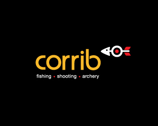
This is logo for Corrib - a shop selling fishing, archery and shooting equipment in Ireland.
I tried to get all aspects of their business into the "fish"
Status:
Client work
Viewed:
10574
Share:


Lets Discuss
I quite like the idea. My only suggestion would be to make the 'fish' slightly more prominent, as it is a clever icon.
ReplyI like the type face and I agree with koodoz
ReplyIt has great potential. Clever idea
ReplyGreat solution!!
ReplyThe mark is clever. Not sure about the type. Maybe it's the colour?
ReplyI love the fish!
ReplyVery clever. Here's %22a little suggestion%22:http://img230.imageshack.us/img230/2875/77946441hu6.jpg, i hope you don't mind.
ReplyLennon, please allow me a second suggestion: http://www.psdlayout.com/suggestion.jpg
ReplyHi, Thanks for the feed back. **I can't actually make it the fish bigger at this stage although I do see where you are coming from.**As for the colors - black and yellow were the existing corporate colors, so my hands are kinda tied on that.**Graft I really like what you did there but I do need the services on there, also I feel the logo makes less sense without the services on it.**The client has asked to put cross hairs within the target now to hammer home the shooting aspect.**thanks again, much appreciated
ReplyOne of the koolest mark I've seen for awhile. well done!
ReplyClimaxDesigns said:*cross hairs... so a bullseye doesn't scream target enough...**Seriously. Nothing more needs to be added to the icon. It's perfect as is!!
ReplyCool mark. I like the suggestion layouts too. Nice feedback.
ReplyMark is so powerful I would increase the size of it?
ReplyYou also might try reversing the fish and writing it Archery,Shooting,Fishing?
Replylogomotive said:*You also might try reversing the fish and writing it Archery,Shooting,Fishing?**Mike, why do you suggest that?
ReplyThanks for the suggestions guys. I'm afraid bar the crosshairs all has to stay the same. **I'm beginning to think that an increase in the size of the mark would have been nice.**Logomotive - not sure why I'd switch that? The order at the moment reflects each services importance to the business.
ReplyWell it's just my opinion and what I might personally do that's all. We read from left to right and when I create anything with an arrow in it I always try to give positive note as in forward progress and I feel the whole logo should work just like we read. Hey nothing wrong with it, just a personal choice. Again love the mark A LOT!
ReplyPlease login/signup to make a comment, registration is easy