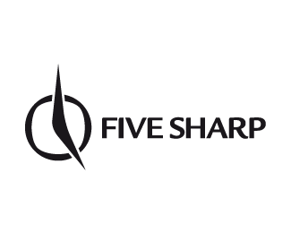
FIVE SHARP
by HelveticBrands • Uploaded: Oct. 31 '07

Float
(Floaters:
2 )
Description:
This was made for a graphic design & marketing company comprised of five people. This is still a work in progress.
As seen on:
http://www.dache.ch
Status:
Nothing set
Viewed:
2198
Share:


Lets Discuss
Nice and clean. I really appreciate your excellent work on type (which is? custom? many thanks:-).
ReplyDache this does not read well at all on its own, the viewer would have to have the description to understand this mark.**If you used a roman typeface it might help sell this idea a little more.
ReplyThanks Thomas, its Kontrapunkt and a custom roman numeral.**admarcbart, I think you may have a different vision to that of the viewer, you see this logo out of context and have seen all the concepts for this till now.
ReplyI like your concept. It's a great idea. However, I somewhat agree with Bart. Also, wouldn't this be more of a logo for a company named 'SHARP'? To me, the roman numeral is'nt recognizable enough to stand as a 5. What if you add the word 'five' somewhere? Maybe right above the roman numeral. Just some thoughts.
ReplyHello Kevin, thanks. I was thinking perhaps an URL in the tagline. This is just an idea I wished to explore before completing the project. My clients and myself are still swaying towards %22this concept%22:http://logopond.com/gallery/detail/18972*I've updated it somewhat, will post on LogoPond when available for public viewing.
ReplyI like this one the best, it's the most unique. I don't know how hard it is to understand... I got it right away but that might be because I've seen the other versions %26 knew the name already.**wouldn't most things that have the logo have the name also? (Bizcards, letterhead, etc.) I think it works!
ReplyThis was the first time I've seen your line of concepts, and I would never have assumed it read %22Five Sharp%22. Whatev.
Replygraphic design and marketing company - they should be a lot more clear with their identity - are they ok with hiring other people for the service they are providing?**Either way this overtly novel and not strong enough to send a message outside of confusion.**(i still love you dache)
Replyi dont get it .... would it not be stronger with the v not being encapsulated by the two lines ... since 5 is V
ReplyThanks for the comments.**@amyblandford : Some people choose to understand sometimes %3B%5E) **@kult house : Whatev.**@raja : Overtly novel, oh well :%5E) Yes, as mentionned it is a work in progress.**@zuhumina : I sympathise that you don't get it.
ReplyDache, while I think this is a clever idea, I don't think it's working at all. Yes we understand but will the general public?.. probably not. I feel it reads as SHVRP if that. But nice idea anyhow.
ReplyYes, as mentionned it is a work in progress.
ReplyUmmmm ,,,, you sympathise .. or you cant explain ... you seem to give but cant receive ... a work in progress must progress ... or rather you choose to digress ... the arrow actually indicates the direction of the logo ... **and to quote ... dache - No need to get personal ..?**or is it not homogeneous to the centuries roman numerals .... ????
ReplyActually i apologise for my rant so before you decide to .... red card me ... i would like to say ....
Replyzuhumina, feel free to email me your opinions from now on instead and Ill be sure to help you understand.
Replya riot u are indeed ... i would email you but its so much easier to post here ....**the question i ask is ... why have you closed up the top of the %22v%22 and have the line at the bottom ....**perhaps this is easier for you to understand .... **http://maryt.files.wordpress.com/2007/03/roman_numerals_complete.jpg**note the character of the equivalent character to 5! Im trying to understand why yours is different ... **My question is ... does the dash/middle bar of the a not work better with a V ..... Even with a line underneath from the centre of the V TO THE end of the word enhances a pencil graphic .... denoting more of a creative studio ... perhaps cliche but im sure you get the point .... perhaps ... *****
Replyperhaps ... u are misunderstanding me ... the concept i love but not understanding the V being closed*****
ReplyPlease login/signup to make a comment, registration is easy