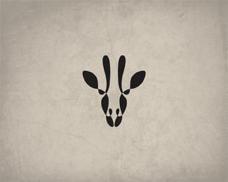
Rhiny
by Jurcek • Uploaded: Feb. 27 '13

Float
(Floaters:
30 )
Description:
Work in progress.
Status:
Work in progress
Viewed:
3811
Tags:
rhino animals guides circles
Share:


Lets Discuss
lots of circles.
ReplyHmm. What are those circles for?
Replyits like the 'golden circle' rule or something like that, something that looks nice but doesn't really hold all that much merit in practice... maybe... perhaps something to strive for, looks pretty, but i cant see using this as a basis for creating a logo ?
ReplyClearly this is not the finished logo guys, rather a process shot to illustrate to us how he created that mighty fine looking rhino. I'm digging it! You've created a nicely reduced iconic rhino here using that circular grid. I've created a few marks this way myself. Perhaps for the masses, show the completed logo as the hero shot, without guidelines and save this process shot for the secondary attachment images (or not). I say job's a good'un!
ReplyThe definitive guide to using circle guides to create a square can be found here: http://logopond.com/gallery/detail/117369
ReplyI just feel like a moron because I call myself a logo designer and never have I ever created a logo using this process. Does that make me a phony? hahaha
ReplyHa! the perfect square. love it, Roy. Jump on board Tabitha, you could always take it one step further and create a circle from circle guides.
Replyit's cool
Reply@vergad, i never said or intimated that it was a finished peice, I just find it very hard to beleive that he placed all those circles and made a rhino, its much more plausible that he made a rhino then polished it using the circles which if that is indeed the case (the latter) its less impressive to see the guide circles after the fact.
Replyit doesn't take anything away from his talent or skill in pulling this off, I just think its not always plausbile if not impossible to create a logo using the golden circle whatchamakalit. And no Tab it doesn't make you less of a designer to not have know or use such a technique... And anyone who says the opposite is off their rocker :D
All good David, It was mainly in response to the question 'what are those circles for?'. Executing silky smooth curves is one of the greatest challenges we're faced with and it certainly can make or break a design. For me, what's impressive is the end result and It doesn't really mater what techniques a designer uses to get them. That said, when a designer does show them (guides), it's nice to see the techniques used to get those silky smooth, oh so beautiful curves. Clients dig it too.
ReplyVery great construction
ReplyYeah i can agree with that Vergad.
ReplyThank you for your feedback. I love smooth and polished lines, so I help myself using circular guides. But that's only one of many techniques. As David suggested, I start out with sketching the logo with hand-drawn circles. After scanning it I outline it with perfect circles. That's it, I hope you'll dig the final thing. And I hope to get some constructive criticism next time instead of useless comments mocking my technique (goes for some of you).
Replythis is how I've been drawing for over 10 years, it's all good
ReplyI should add that my clients have been hanging up these kinds of process shots all over their offices as artwork, there is a beauty in them for those that choose to see it and understand the mathematics and formulae for curves. That's what Bezier's curve (or Bernstein polynomials) were based on. Could also be just a severe case of designer OCD haha
ReplyOn the other hand, if it is not a part of your genuine process, and it's just an arbitrary kind of thing, then you shouldn't be doing it and claiming it is.
I feel like many designers these days are using circles, guidelines and grids as a crutch to demonstrate or look they know what they are doing. Sometimes even on an unbalanced design. I see it as more of a trend. One thing I've learned is the eye don't lie. I just think it's a wee bit overdone and over exaggerated these days.
ReplyImagine putting grids and guidlines on one of Simon Frows works (in wireframe) now that would be a challenge. ;)
ReplyLet's see it w/o the guides.
ReplyMy eyes are my grids and guidelines. I don't have time for all that fluff. It may help others, it may not. I think it serves its purpose when you are designing a font or establishing consistency in typographic design. Otherwise I just squint my eyes more for better accuracy ;^P
Reply@Jurcek you marked the logo ' Not seeking critique, comments fine ' so they may be mocking but non of these comments are particularly ' useless ' :D
ReplyThere's nothing really to critique beyond that, the Rhino as I think we have all mentioned, or intimated by not exactly mentioning but taking the time to post a comment is superb...
Since it's being discussed, I'll just add my 0.02$. I think the whole logo construction thingy people reveal like on behance to show how a mark was made using guides has gotten to be a tad bit boring. As someone pointed out, why would you go through all that hassle of creating a ton of circles to create a minimal rhino? *shrugs*
ReplyOh and for the record, nice work Jurcek, like
ReplyCould also be a Rhino with lot of bee's and insects hovering around and messing with him...:)
ReplyPlease login/signup to make a comment, registration is easy