Multipinions
by pausedsn • Uploaded: Feb. 25 '13 - Gallerized: Feb. '13
Description:
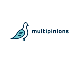
This is the final and approved logo for the Indian company called Multipinions which run a network of forums (online discussion boards). The client wanted something lighthearted, casual and easy recognizable totally opposed to the idea of corporate logos. This is one of those logos that have a strong 'backbone' behind it. Pigeon as a symbol of communication and transfer of messages. Speech bubble as a wing is clear symbol on the forums conversations (opinions) and with open line pigeon I wanted to show the openness (freedom) of the conversations on these forums.
Status:
Client work
Viewed:
12902
Tags:
logo
•
shape
•
simple
•
mark
Share:

Lets Discuss
This is awsome. You managed to get a pigeon, a speech bubble and text lines all in the icon...I love it. Respect
ReplyReally nice harmonious mark and logotype!
ReplyAwesome concept! Very smart work here Nitish!
ReplyNitish and Maria - I'm doing my best. Thank you!
ReplyLuma - Try to guess the user's profile :^)
Haha ooops sorry about that Jovan! My mistake.
ReplyVery nice logo, Jovan!
ReplyNice type and overall feel, but the pigeon seems very static and it's just standing there! It's 'derpy' to to speak. I think there's more character to be had for the pigeon!
ReplyHope that helps ;)
I love the vibe of this!
ReplyNice execution.
Replysimple and effective. well done.
Replythat's a smart concept
ReplyThank you all people very much!
ReplyPlease login/signup to make a comment, registration is easy