METHOD
by effendy • Uploaded: Feb. 22 '13 - Gallerized: Feb. '13

Float
(Floaters:
52 )
Description:
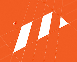
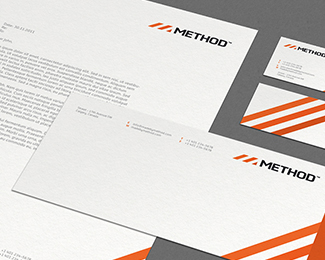
Identity designed for Calgary, Canada based web design & development company.
Concept: METHOD means process. And process lead to the idea of depicting steps. So I came up with an M made up of steps. Also there are 3 hues of orange applied to the individual steps.
Thanks to my buddy
Status:
Client work
Viewed:
22986
Tags:
method
•
web
•
ali
•
effendy
Share:


Lets Discuss
... simple and clean. like it!
ReplyThe hues are so subtle which is what I love.
ReplyI like!
Replynice work.
ReplyQuestion: is that envelope design final? it's beautiful, but i have a hard time believing that would be compliant with post office regulations.
Everything done just beautiful!
ReplyThank you so much for the comments folks.
ReplyStruve - Thx! Not final yet. Will fix it asap. Thank you for pointing out mate. :)
Paul - Cheers my friend :)
Great work as always, Ali
ReplyLike this a lot, Ali.
ReplyThanks a lot Saad and Sean :)
ReplyWow this is so awesome. Is this a custom font?
ReplyCheers! I guess, its a bit custom.
ReplyNice overall feel, but I think you need to tighten up the 'E' and the 'T' a little bit.
ReplyGreat work ;).
I have to disagree about the E and T. I think the spacing is on point and tightening those might make it look unbalanced. But, that's just my opinion! :)
Reply^ i was just going to say the same thing. you beat me to it, tabitha! i think if anything, the letters could breathe a little more (but just a little).
ReplyMmmmmmm.
ReplyFixed spacing on Colin's suggestion.
ReplyI think now its looks more solid.
Thanks Richelt, Tabitha & Colin for stopping by.
In case you missed the full presentation on behance, then take a peek here : http://www.behance.net/gallery/METHOD/7554895
Absolutely beautiful! One of my all-time favourites.
ReplyPlease login/signup to make a comment, registration is easy