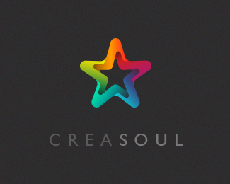
CreaSoul
by mariagroenlund • Uploaded: Feb. 20 '13 - Gallerized: Feb. '13
Description:
Logo for design agency in Istanbul/Uzbekistan.
The mark for CreaSoul is inspired by a group of paintings made by artists trying to capture what they thought the soul looks like.
http://www.behance.net/gallery/A-Brand-New-Year/7210969
Status:
Client work
Viewed:
59474
Tags:
maria
•
grønlund
•
colorful
•
abstract
Share:



Lets Discuss
Such wonderful movement and colour in this logo. It grabbed me straight away. I don't think there's much left to do this.
Replyi like it so much! Congratulations!
ReplyBeautiful! I think the type would be a little more cohesive if all letters were the same weight. But, it's wonderful regardless. :)
ReplyI'd make the type one weight, but the mark is striking. wonderful mark.
ReplyBeautiful!
ReplyNice touch!
ReplySuch an amazing work, congrats! :D
Replylovely!
ReplyWonderful. Colourful and eye catching.
ReplyYou're work is gorgeous. But you haven't showcased your Skjold Plast project yet, how come?
ReplyThank you cnasshan :) I'll showcase the Skjoldplast logo shortly. How could I forget that?!
ReplyDear Mariagroenlund,
ReplyYour work is lovely, and i would like to personally contact you via email, or skype, to have the opportunity that you design my company's logo.
Im looking forward to working with you.
Regards,
Thank you very much pearlside. My email is [email protected].
ReplyBeautiful work, especially the mark. I'm curious, how you will take this to a one color?
ReplyThank you jrbond. I wouldn't.It's possible to make a version with an outline only, which I've shown in the presentation for the costumer. But it's not optimal.
ReplyVery-very good stile! So nice and colourful!
Replythis inspires...
ReplyVery beautiful! what type is you use for it?
ReplyPlease login/signup to make a comment, registration is easy