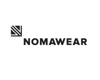
Nomawear (Redevelopment)
by HayesImage • Uploaded: Feb. 11 '13 - Gallerized: Feb. '13
")
Float
(Floaters:
27 )
Description:
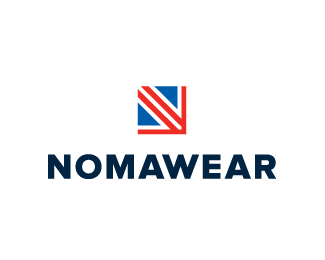
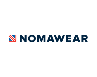
Previously being developed as Anoma (An amalgamation of Anna & Norman) changed names (Nomawear has now been registered) as some found the original moniker too close too 'enema'.
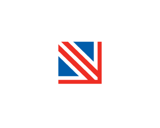
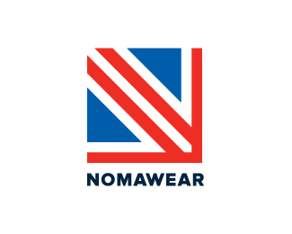
The mark based on the top-left portion of the Union Jack, Nomawear are based in Northern English province of Carlisle. The mark forms a abstracted N shape & an arrow leading the eye towards the name.
Nomawear is a formal fashionwear startup. Main image updated.
Status:
Work in progress
Viewed:
10106
Tags:
Label
•
Arrow
•
Flag
•
Fashion
Share:


Lets Discuss
Open for critique on this.
ReplyNice branding potential here, Josh. IMO, the type needs a bit more work on the kerning... Fine tuning :)
ReplyI like it. Two things: I feel like the A-W kerning is a little tight, and maybe the W-E could come in a smidgen. Also, this might just be me, but I'd be curious as to what it looks like with the corner of the mark kissing the corner of the N, as opposed to that bit of space. Have you tried that?
ReplyThanks for the input guys!!
Reply@Sam interesting thought, I'll have tinker.
Added a variation with adjusted kerning & an example of the mark touching the type.
ReplyLooks great man. Nice work!
ReplyI like the way you have dismantle 'N' The mark has to the potential to be memorable. Cheerz
ReplyClean and smart... good work.
ReplyThanks guys!!! I'm working on some print collateral ideas as we speak :)
ReplyI like everything about it. Good job buddy!
ReplyThanks guys :) This was a tough one!!!
ReplyTough problem to solve, man. I think you pulled it off.
ReplyThanks Kev, was indeed a struggle :)
ReplyI'm not saying that I'm the first to use the Union Jack in this context but, a similar typeface, a similar colour palette...and identical concept; http://www.logodesignlove.com/made-in-britain-logo-by-the-partners
ReplyPlease login/signup to make a comment, registration is easy