Orchard Studios
by klarrita • Uploaded: Jan. 23 '13

Float
(Floaters:
2 )
Description:
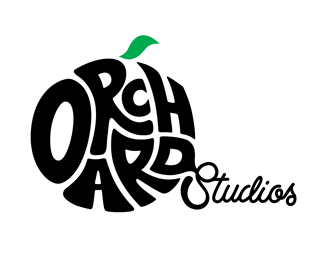
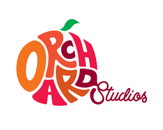
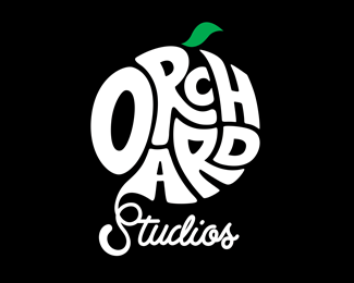
Orchard Studios is a shared space of like minded creatives, working in different fields. Each letter in the logo represents a person or company in the studio as together they form the juicy fruit.... Each of us is skilled in a different discipline, none of us has the same shape.
Status:
Client work
Viewed:
2863
Tags:
•
Cuba Street
•
•
Orchard Studios
Share:

Lets Discuss
How did you do this? Was it Envelope Distort in Illustrator? I would be interested because whenever I try to do these type of designs they never distort that well
Reply^ that comment is priceless.
ReplyWell... I'd love to have function to create this with a single button, but then we would be out of job, right?
ReplyPlease login/signup to make a comment, registration is easy