Alice Hotel
by natic • Uploaded: Jan. 07 '13 - Gallerized: Jul. '13

Float
(Floaters:
33 )
Description:
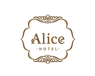
Logo for hotel "Alice" that is located in Berdyansk town by the Azov sea
Status:
Client work
Viewed:
10232
Tags:
decorative
•
Alice
•
hotel
Share:


Lets Discuss
Looks great... ! :)
ReplyWow! Amazing)
Replythank you all
ReplyLove that containing shape and what you did with the Alice type. It's beautiful. My only critique is it feels like you need something above the Alice type since there is the Hotel type below it. Perhaps an established date or some sort of flourish. Another option is to try moving the Alice and Hotel type up slightly in the containing shape. Still, I love this.
ReplyThank you for your detailed comment
ReplyLike how you added the flourish both to the containing shape and the lettering. It's just enough to read well together and not be distracting. Many times people add too much flourish in the lettering and it becomes overwhelming, but yours works very well. Great job.
Replythank you so much, jenn
ReplyGood style.
ReplyNice type
ReplyPlease login/signup to make a comment, registration is easy