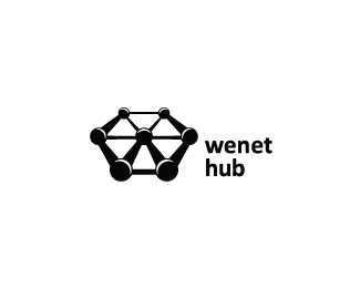
Wenet Hub
by V3creation • Uploaded: Jan. 01 '13

Float
(Floaters:
4 )
Description:
Wenet Hub is a website developing company which collects designers, developers, programmers from different places and bring them at one place.
The mark has touched the Three different aspects of the Company
1. People= the circles are representing the people who are from different places
2. Network= the lines which are interconnected shows the network being developed &
3. Hub= the center circle is the main HUB where every circle touches
And the company Initial "W" is also formed there.
Status:
Work in progress
Viewed:
2987
Tags:
web
•
people
•
hub
•
network
Share:


Lets Discuss
nice work. Only the text do not fit to the image
Replyqyper, You mean a different font or font\'s placing.
ReplyPlease, I would love to have some suggestions.
I\'d use a font with round corners and place the text underneath the mark.
ReplyThank you very much brammoolenaar.
ReplyMy client liked the mark but wanted to do something with the type. So I added a latest change in the font type and placing.
Please login/signup to make a comment, registration is easy