Personal identity version 2
by leethal • Uploaded: Oct. 18 '07

Float
(Floaters:
0 )
Description:
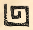
This is my own logo/stamp. Its a sybol which encompasses my names initials. I wanted to include it in my design for my own site "leegrace.com", which I have the domain name bought and registered, but nothing uploaded yet! This would be the edgier version of the stamp as opposed the the other version
Status:
Nothing set
Viewed:
2026
Share:

Lets Discuss
Personally, I think you should stick with one version, that version being this graphic with the other text.**I really like this version of the graphic because it makes the L and g stand out more. As for the font, I just don't like grunge fonts.
Replygenerally my rule is grunge picture, straight text, or straight picture, grunge text, never both.**i think a nice sharp square helvetica or BlueHighway (if you're using free fonts) would make it quite sharp.
ReplyThanks for the comments. I think I agree with both of you. Blue highway might be a good choice too
ReplyPlease login/signup to make a comment, registration is easy