Growing Up
by jueves • Uploaded: Nov. 27 '12 - Gallerized: Sep. '14

Float
(Floaters:
14 )
Description:
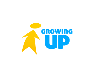
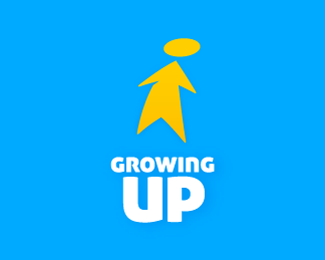
A simplified silhouette of a kid plus an arrow pointing one objective or goal
Status:
Work in progress
Viewed:
8476
Tags:
•
growing up
•
children
•
kid
Share:


Lets Discuss
Good idea!
ReplySimple and clever.
Replygood work
ReplyThanks a lot guys,
ReplyStrong solution. Feels own-able.
ReplyWhere is the logic? Where indeed. Much of what you said is something you've learned and now believe and while, to some degree, there may be a little truth in it I would not say that this design was wholly devoid of logic. Both the mark and type have curves and straight lines that subtly compliment each other therefore lending a great deal of charm to the overall result.
ReplyI think it's worthy of Gallery. Any logo can be improved. I've seen far worse!
ReplyWell for one it will never be the same because too many pirated stuff coming from here. I for one don't post much anymore.
Reply@lefty, there's a preview button to review your comment before posting, also i gotta disagree with you about this logo, i think the mark and type lock up well and compliment each other, are you saying that because the human is stylized form here it cant work together? A far as conpcet, ii'm not sure how it gets any simplier, growing up, person presented as arrow pointing up at a disc (the head) forward direction, growing etc. I get all that from this logo...
Reply@Mike, not sure what to tell you guys as far as that goes, your work can be pirated from any number of sites, if you post to dribbble or behance or coroflot carbonmade etc, your work can be lifted just the same as here. Just saying tht its not specifically a 'logopond' thing.
David. I know. Correction,.. I don't post anywhere much anymore period.
Replyfrankly, i was also surprised to see this in gallery ;) Although it has some quality idea wise, overall impression (colors, balance, typography layout, feel) is not something i would pick for a front page ... but that is ok, this is inspiration site, hence, all ok.
ReplyShifting the conversation over to the lifting and plagiarizing; I must say I agree with David. This can, and does, and will happen anywhere. Online, in bookstores, over the television. No way around it really from happening. Just minimize the damage once it's been done is the best we can hope for. Me, personally, I stopped caring about it a while a go. It's neither here nor there to me if someone lifts my work or not. I am, if I may, reminded of a quote by Shakespeare in Othello: "The robbed that smiles steals something from the thief." Now I'm not saying we should all feel this way and accept plagiarism and plagiarists for what they are. But, in some ways, I am. It can't be avoided entirely. But it shouldn't deter you from moving ahead either. And by moving ahead I mean continuously developing yourself as a designer by sharing your work and by doing so perhaps inspire others too.
ReplySmile.
Well written, Nido.
ReplyWell if this logo has done anything its 'inspired' this lively conversation, job accomplished hahahaha!
ReplyGuys, thanks for your comments and constructive thinking; its always useful and encouraging.
ReplyStill, (IMO) logo and type work very well; both have curves and straight lines; also since its somehow related with the kids market i wanted to give (i dont know how to say) a didactic look and feel, so i made the text big, making it even easier to read.
Also i wanted to play more with big flat surfaces, thats why i made text big and bold,
Please login/signup to make a comment, registration is easy