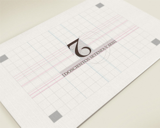
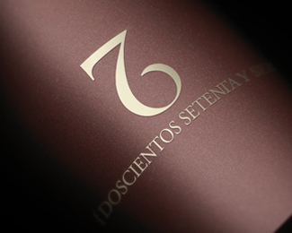
276 {two hundred seventy-six}
by sazky • Uploaded: Nov. 23 '12 - Gallerized: Nov. '12

Float
(Floaters:
36 )
Description:
The constant changes in technology and the convenience they bring, make work and facilitate human activities and achieve some degree of automation. These changes result in setbacks and damage in other areas, such as graphic design, which is becoming more gimmicky and lacking in concept and objectives, forgetting its true essence is communicated in the most simple and effective as possible.
Simple does not mean easy, simplicity implies debugging, neatness and bring everything to its most elemental: that is the teaching left us by the great masters of graphic design.
Two hundred seventy-six, intends to apply the concept and revive what until then had forgotten: the tradition and simplicity. This is achieved by a refinement of line and form, is more than meets the eye or is somehow different than it seems at first glance.
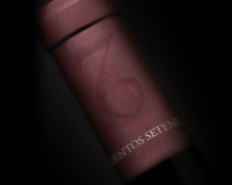
THE CHALLENGE:
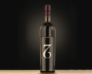
Generate the identity of a wine that is preserved and grows in the bottom of the water, with the distinction of having within only 276 bottles.
THE SOLUTION:
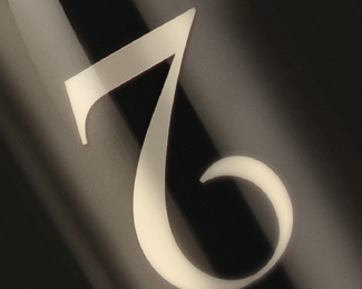
Create an isotype demonstrating the qualities and characteristics of particular wine, ie classic, elegant, evocative and innovative testing it was emphasized in the total number of bottles submerged in order to remind the public product exclusivity.
As seen on:
http://www.behance.net/gallery/276-Doscientos-Setenta-y-Seis/1168169
Status:
Work in progress
Viewed:
9521
Tags:
276
•
wine
•
camilo jimenez
•
sazky
Share:
Lets Discuss
I like it !
ReplyUpside down 2 too!
ReplyI love it!
ReplySociety 72: http://www.asenpetrov.com/gallery/society-72.jpg
ReplyI think while they share a common similarity, this one is executed much better and adds a nice twist. Pouring the wine you will see the 2, then the 76. I find it quite intriguing and done very classy.
ReplyWow, it\'s genius!
ReplyRu_ferret still can\'t believe, that someone do logos better than he did, stop looking for similarities and do something new!)) Gosh, behaves like a child...))
Yana, feel free to keep your opinion to yourself. The logo is not original and I belive the Gallery is for new ideas.
ReplyJust as Nikita\'s, my first thought was Society 72 logo. It sure does have similarities but again, I think they can live together. Btw pointing out for similarities is not behaving like a child, it\'s actually very much helpful for designers and their clients.
ReplyGreat sign
ReplyI think your all getting a little too serious. I actually did the same concept in 2007 (2/7) with a four way ambigram. There is always going to be something similar out there done.
Replyalways someone who did it before. http://www.graphicdesignforum.com/forum/showthread.php?t=23971&page=2
ReplyMike, you are so old! :)
ReplyIt\'s pretty hard to tell these days what is original, but anyway there must be people who cares about that.
Many clever logos were taken from the gallery because someone had done it before. Sometimes they were even better than the originals.
ReplyWell I added this one and I also did a similar concept before this (which I see no problem with).. so I guess it's Davids call now.
ReplyI think its fine. I think they can exist together its pretty clear the thought process was different.
ReplyI will say that\'s a hell of a lot of \'designer jargon\' in the description lol
Yana keep the comments relevant to the logo not other users please
Well said @Rokac
Reply@Yana, I believe you were happy when we defended your Colt logo. No?
I agree with Rokac in this case, it\'s different. So, nobody can use numbers in their works after Society 72, don\'t think so, but that way they did it, sure. By the way is it one studio? http://s3.amazonaws.com/creattica/uploaded-images/0004/3278/27_big.jpg I thought you talking about it actually))))))))))
ReplyFirebrand I wasn\'t happy to see their work with my execution.
I must agree with logomotive on this. The reversed 2 when pouring wine is faceup and that\'s actually quite brilliant. I thought the 2 looked forced upside down but after you pointed it out, it makes perfect sense.
ReplyNice work.
I thought your mark was quite brilliant so i took the liberty to see if i could try a variation of it since i thought i saw an ambigram in it and indeed i did. Just a suggestion, if you split the 7/6 and repeat the 6 but invert it and add it to the top. You get an ambigram and the logo should read 276 face up or in reverse.
Replywoow ...
Replyi love the twist, when we see the logo, i can only see 7 & 6 combination, but when pouring the wine up side down, 2 exist! great one, simple and nice! And i do agree its does share similarity concept to society 27 logo, they share the \"cleverness\" of combination of the name. That\'s is.
ReplySo smart!
ReplyLove it! great work
Replygreat & clever design
ReplyExcellent job,
ReplyThis one feels so familiar! In trying to make an ambigram of the 24/7 logo, I\'ve made variations in which the 7/2 look almost exactly like this. It\'s funny how we can come up with the same things independently.
ReplyExcellent mark, sazky. I love that it works so well for this particular product (the up-down pouring movement). I\'m not fond of the curly brackets right now, but they might grow on me.
Maybe you should let us know where we\'ll be able to get these bottles :)
Please login/signup to make a comment, registration is easy