Air HVAC
by AMart77 • Uploaded: Nov. 05 '12

Description:
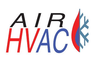
logo for a HVAC company.
Status:
Student work
Viewed:
1740
Tags:
HVAC
Share:


Lets Discuss
If I was a person and didn\'t understand what HVAC was I would be slightly confused. But the logo of the fire and the snowflake makes me know it has something to do with air and ventilation. The snowflake and fire thought I think it is great looking logo. The italicized of the Air and the italicized of the HVAC are slightly different and kinda throwing me off. See what it would look like if they were both the same angle with each other. What I learned in Typography and page layout is that type needs to be lined off perfectly with each other. Maybe give it a shot! It looks great though and the color of the logo looks good!!
ReplyIt is bold! I think your choice of colors is fantastic.Flame and snowflake combined shows the contrast. Because it was elongated I had to look twice. This logo is versatile It could be used in various ways, business card, letter heads, and vinyl.
ReplyI like the red color for HV and the blue for AC. I think that helps tell the story of what the company does. I think most people have seen enough HVAC companies to know. I also think you could remove the AIR completely and still get your point across though your design. Shrink down and widen out the flame/snowflake making it the same size as the HVAC and let that be your design...just as a suggestion.
ReplyPlease login/signup to make a comment, registration is easy