FÄRJEKARLEN
by watermarker • Uploaded: Nov. 01 '12 - Gallerized: Nov. '12

Float
(Floaters:
64 )
Description:
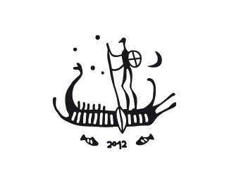
This is a design for an upcoming trekking equipment brand. Färjkarlen (se) means ferryman and I made it in the style of ancient nordic rock drawing plus some accessoires and a simple compass as a symbol for travel. Sweden is a very popular location for trekking and hiking and my customer wanted a connection to it. Note: The correct spelling would be Färjkarlen - the added letter 'e' was a choise, my customer made for better international reading. Still looking for a better typo.
*rejected*
Status:
Unused proposal
Viewed:
7158
Tags:
ferry
•
man
•
boat
•
ship
Share:


Lets Discuss
Amazing ethnic mark!
Replyyup ... this one loks really good ... love the feel of it !
Replyawesome!!!!!
ReplyGreat style!
Replyawesome!!!!!!!!!!
ReplyWow! Thanks alot people! I am thinking about altering it. 1. Isn\'t the compass too much and draggin concentration away from the center? 2. Isn\'t the space for the ferryman too small/ background too small? 3. Shouldn\'t I beter use a more modern/classic font to have a contrast to the mark? :D
Replythat is quite a nice mark and interesting. I personally think you should leave the mark alone but maybe work on the type.
Replystyle.
ReplyI like a lot the style of this, congrats!
ReplyVery nice and very unique.
ReplyOh! I hate to get WIPs into gallery! :D Thanks for all comments and floats guys!
ReplyVery cool, love the style and the illustration.
ReplyThank you Sean! Unfortunately the customer won\'t take it as it is.
ReplyHe sees danger in connection to nazi stuff because of the runes-like typo and nordic theme. It probably will be some simplier version. :/
Please login/signup to make a comment, registration is easy